The Rothschild family, then just a generation removed from Frankfurt’s Judengasse ghetto, emerged as a financial dynasty centered in London and Paris in the early nineteenth century.
建築
倫敦也患上了「摩天大樓瘋魔症」
MICHAEL KIMMELMAN 報道 2013年03月01日
Philippe Ruault/OMA
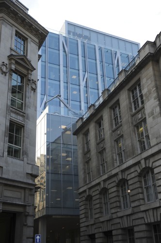
「新庭」是羅斯柴爾德銀行位於倫敦的總部大樓,由荷蘭大都會建築事務所的艾倫·房龍與雷姆·庫哈斯設計,大樓前庭背後即可看見聖斯蒂芬·溫布里克教堂。
倫敦——那天,我可被“新庭”(New
Court)給迷住了。新庭是羅斯柴爾德銀行(Rothschild
Bank)位於倫敦的總部大樓,由荷蘭大都會建築事務所(OMA)的艾倫·房龍(Ellen van Loon)與雷姆·庫哈斯(Rem
Koolhaas)設計。整棟大樓富麗豪華,與四周環境和諧融為一體,幾乎隱逸其中。一位曾參與該項目的建築師,半開玩笑地將這棟新建築稱為“成熟的老
樓”。
這話的意思,是說你恐怕無法想像,它竟出自庫哈斯之手。庫哈斯曾是個頗具代表性及具有影響力的人物,聽說他近日惋嘆“你死我活的鋪奢競賽”,認為這
樣的狂熱追求推動了華而不實的新興地標建築激增,一棟接着一棟,直至建築市場崩潰。巧的是,新庭恰是在市場崩潰前提出設計委託,歷時數年才竣工。因此,正
如庫哈斯反覆宣揚的思想一樣,這棟建築是整潔、巧妙地為變化的大環境度身定製。
按圖放大

Andrew Testa for The New York Times
近日剛剛完成翻修的國王十字火車站主候車大廳,特色即包括圖中的穹頂,由約翰·邁克阿斯蘭(John McAslan)設計。
按圖放大

Andrew Testa for The New York Times
圖右的「碎片」大廈,由倫佐·皮亞諾(Renzo Piano)設計,即將竣工,是目前倫敦最高的建築物,若隱若現於城市的天際。
按圖放大

Andrew Testa for The New York Times
中央聖馬丁藝術設計學院的廣場打造了一個臨近學校的公共露天場所,學校本身則棲身於一棟由穀倉改建的大樓。
倫敦有這麼個情況,已故評論家艾達·劉易斯·哈克斯特貝爾(Ada Louise
Huxtable)曾將其稱之為“摩天大樓瘋魔症”(Skyscrapers Gone
Wild)。她指的,是那些因為新技術和瘋狂投資相結合而滋生的,“超大、扭曲、與環境完全違和”的高樓,棟棟競相攀比高度,比誰更吸引眼球。其實這座城
市曾如此驕傲,根本不屑於此。瑞奇·博得特(Ricky
Burdett)在倫敦經濟學院(LSE)教授城市研究課程,那天我同他一道在城裡閑逛。他領我去看了利登豪爾街122號一棟綽號“奶酪刨子”
(Cheese Grater)的寫字樓。這樓是理乍得·羅傑斯(Richard
Rogers)設計的,距新庭不遠,位於倫敦金融區腹地。旁邊還有棟樓,頭重腳輕,綽號“對講機”,看了之後,我忍不住對博得特說出我的疑惑;我多想知
道,拉斐爾·維諾力(Rafael Viñoly)當時到底是怎麼想出這麼個造型的?
河對岸,倫敦橋(London Bridge)站之上,是幾近完工的“碎片”(Shard)——由倫佐·皮亞諾(Renzo Piano)設計的倫敦最高建築——直聳雲霄。
周圍的社區也在變化。去年夏天奧運會的總體規劃原則,就是要在史上向來破敗的東區(East
End)打造一個繁榮的新中心。奧運村正改建為面向不同收入階層的混居住房與公園(園區部分由菲爾德設計事務所[Field
Operations]的詹姆斯·科納爾[James Corner]擔綱設計,他曾參與設計紐約“高架線公園”
[High Line])。至於效果如何,跟“碎片”一樣,要等竣工後才見分曉。
英國首相大衛·卡梅倫(David Cameron),與搶人眼球的倫敦市長鮑里斯.約翰遜(Boris
Johnson)一道,於上月大張旗鼓宣布投資8000萬美元,在“科技城”(Tech
City)打造一個市政文娛中心。所謂“科技城”,就是東倫敦舊街環交路口(Old Street
Roundabout)那一片幾個街區的別稱。“完了,社區沒了。”社區一些頑固分子不無感慨,擔心政府規劃一旦介入,當地一貫自下而上的發展印記將被抹
滅——實際上,這“社區”的“發展”,無非處於七拼八湊的草創期而已。
他們真正擔心的,其實應該是首相和市長公布的規劃圖裡,那種位於市郊住宅區的、辦公園區風格的建築。隨着項目的開展,若要提升這堪憂的環交路口區自身,應當制定更好的規劃才行。
最具戲劇性變化的,要數國王十字(Kings Cross),該地區長期以來犯罪猖獗,貧困不堪。聖潘克拉斯(St.
Pancras)火車站與國王十字火車站在此交匯。二十來年間,這一區經歷了翻天覆地的變化。最近,為迎合數年前聖潘克拉斯站的翻新,國王十字站的主候車
大廳,也改造了個偽哥特式的陡降頂棚,由約翰·邁克阿斯蘭(John
McAslan)設計。谷歌公司計劃將倫敦總部開在隔壁;高檔住宅、廉租房,以及商業開發,也已逐步在周圍落戶,或正欲進駐。
這項價值數十億美元的大改造項目背後,是英國地產商白銀集團(Argent
Group)。該集團堅持優良城市發展戰略:混合利用,緩慢增長,以步行者為本的街道,通情達理的翻新與新建項目的結合,以及着重充足而有活力的公共空
間。上個月,中央聖馬丁藝術設計學院(Central Saint Martins College of Art and
Design)外一處花崗岩地面的噴泉廣場剛剛開放。中央聖馬丁學院於2011年搬進一棟19世紀的六層糧倉。該建築由倫敦斯坦頓·威廉姆斯建築事務所
(Stanton Williams
Architects)巧妙改造,設計嚴格遵循保護原有風格的原則,打造出寬敞、柔滑、高挑的內部空間,一箭雙鵰,兼作學校與新公共廣場。
國王十字的周邊開發,使一塊以前的閑置工業區倍添中產氣質,而這恰恰也是“碎片”大廈附近老街坊所擔心的。這棟大樓,如同一座大山矗立在酒吧和住宅
區,鶴立雞群,將會改變整個區域的房地產局勢。從表面上看,這棟大樓粗笨龐大,其貌不揚。不過,在國王十字這樣的鐵路樞紐地段,提高建築密度,行之有理。
預期未來各種寫字樓、公寓、餐館及大廈觀景台的組合,將可與倫敦眼(London
Eye)平分秋色,增加該地區的就業及財政收入。同時,作為項目的一部分,每天吞吐30萬乘客的車站整潔一新,翻修之後更具吸引力。
從遠處看,“碎片”大廈外觀的側立面不再如整體般顯得突兀。水晶般的刺眼效果,也並不如許多倫敦人所擔心的那般顯眼。在某種柔和的光線之下,整棟大
樓幾乎隱匿不見,樓冠逐漸淡化成網眼狀的屏風簾造型——這一招,皮亞諾先生在設計紐約時報大廈時就嘗試過,但失敗了,搞得大樓頂部平台就好像未完工一樣。
這回,通過延展大廈的錐形頂部,使其多面匯交於一點,網屏造型終於適得其所。
另有30多座摩天大樓正(或即將)在這座城市拔地而起。幾個世紀以來,聖保羅大教堂(St. Paul's
Cathedral)的穹頂一直主宰着城市天際線的制高點,直到1980年國民西敏寺銀行塔樓(National Westminster
Tower)的出現。之後又有了諾曼·福士特(Norman Foster)設計的“小黃瓜”(Gherkin;即瑞士再保公司[Swiss
Re]總部大樓——譯註)。如今,競爭已經展開。
這一切,部分歸因於前市長肯·利文斯通(Ken
Livingstone)的有力政策,以及其後任約翰遜先生在這個方向的追進——大推高層建築增長,並以大規模轉型為發展重心。這一政策頭一次為倫敦吸引
來大量國際知名建築師。但據《觀察家報》建築評論人羅文·摩爾(Rowan
Moore)近日撰文所稱,這一政策的規劃體系自我感覺良好,其許多項目,無非上面大手一揮,就順利通過審批流程。
“它們的細節有何特別之處?”摩爾問道,“它們的整體設計理念是否具有協調性或完整性?它們的底層能否創造美觀大方的新公共空間?”
這就要回到大都會事務所為羅斯柴爾德銀行總部設計的新庭了。新庭總使用面積22.6萬平方英尺,僅15層,算不上摩天大樓,但仍比緊鄰的其他建築都高。所以,這棟塔樓的外觀辨識度,遠比許多摩天大樓更為突出、亮眼——比如,隨便舉個例,若拿它同“對講機”比較的話。
自1809年起,羅斯柴爾德家族就佔據着聖史威丁巷(St. Swithin's
Lane)這塊地盤,這條小巷不過10英尺寬。新庭取代了20世紀60年代興建的老總部大樓,而更早之前這裡曾是一棟維多利亞時期的老建築。大樓後面是聖
斯蒂芬·溫布里克教堂(St. Stephen Walbrook Church),由克里斯托弗·萊恩(Christopher
Wren)設計,自1680年建成後一直是此地的地標建築——直到羅斯柴爾德的辦公樓落戶於此。200年間,“羅氏”大樓幾經更迭,遮蔽了身後教堂的風
采。
大都會事務所的大膽構想:從銀行大樓中間開闢一條通道,將新大樓提升到地面之上,藉以露出教堂容顏;同時,通過一個半開放式的廣場,將帶有屋頂的銀行前庭,與聖斯蒂芬教堂的墓園連接起來。
這一方案巧妙而優雅。如今,一條玻璃和鋁飾構成的柱廊勾勒出了街道的邊界,後面則是寬敞的廊道和步行道,如畫框般精緻地構築出教堂的形象。這一設
計,為狹窄的街道平添透明感與驚喜,營造了貼合市政的平凡壯觀;同時,新樓展露萊恩舊樓的風姿,創造出雙人芭蕾舞版的效果——羅斯柴爾德大樓向聖斯蒂芬教
堂頷首致意。
管窺其奢華細節:私人會議室里是高檔定製的布藝織物;華麗的大堂中擺設着實木書桌和匠心裝飾的幕簾;副樓底樓對外開放,存放着羅斯柴爾德家族的檔案
文獻,內有手工雕刻的橡木櫥櫃以及上年頭的大師級藝術名作。任何與“大都會”可能聯繫在一起的粗糙、搗騰,全然不見;一切盡顯平和、光潔,卷冊間串聯出一
股詩意。
我前文提到“半開放式”,只因駐足聖·史威丁巷,儘管你可以看見聖斯蒂芬,卻無法走進教堂。大樓的前庭與教堂的墓園之間有一扇緊鎖的大門,銀行警衛
不鼓勵好奇的窺探。所以,十分不幸,開放的建築,遭遇了偏執狂一般的建築,後者及其同儕,一個多世紀以來,正慢慢重塑着如倫敦、紐約般的城市。
我投開放性一票。
本文最初發表於2013年1月10日。
翻譯:江烈農
Where Modernity Frames Tradition
By MICHAEL KIMMELMAN March 01, 2013
LONDON — The other day I caught up with New Court, the London
headquarters for Rothschild Bank, designed by Ellen van Loon and Rem
Koolhaas of OMA. Opulent, context friendly, almost stealthy, it’s an
“adult building,” as one of the architects who worked on the project
half-jokingly put it.
Meaning that it’s not what you might expect from Mr. Koolhaas, who
has been heard recently lamenting “the rat race of extravagance” driving
trophy architecture before the market tanked, when he was such an
emblematic and influential figure. As it happens, New Court was
commissioned before the crash but took years to be finished. So like Mr.
Koolhaas’s mantra, it’s neatly tailored for a changed climate.
London has a case of what the late critic Ada Louise Huxtable once
called Skyscrapers Gone Wild. She was talking about the “supersized,
contorted, totally out of context” towers, resulting from a cocktail of
new technology and mad money, competing for height and attention, from
which this city had once proudly abstained. I looked around town with
Ricky Burdett, who teaches urban studies at the London School of
Economics. He showed me 122 Leadenhall Street, nicknamed the Cheese
Grater, an office building by Richard Rogers going up not far from New
Court in the heart of the London financial district. I wondered aloud
what Rafael Viñoly could possibly have been thinking when he came up
with the top-heavy design for the building that has been nicknamed the
Walkie-Talkie, close by.
Across the river, atop London Bridge Station, the nearly completed
Shard by Renzo Piano — London’s tallest building — loomed over the
skyline.
Neighborhoods are changing too. The master plan for the Olympic Games
last summer entailed creating what’s meant to be a prosperous new
center in the historically downtrodden East End. Olympic Village is
being turned into mixed-income housing and parkland. (James Corner, of
Field Operations, who worked on the
High Line in New York, is designing part of the park.) As with the Shard, we’ll have to wait to see how it works after it’s finished.
David Cameron, the British prime minister, and Boris Johnson,
London’s flamboyant mayor, announced with some fanfare last month a plan
to invest $80 million in the construction of a civic center for Tech
City, as the blocks of East London near the Old Street Roundabout have
come to be called. “There goes the neighborhood,” was the lament of some
die-hards in that scrappy start-up community, who feared the area had
lost its cachet if government planners wanted to horn in on what has
been a bottom-up development.
Their real cause for concern ought to have been the suburban
office-park-style building in the drawing that the prime minister and
mayor unveiled. A better plan, to upgrade the grievous roundabout
itself, should emerge as the project evolves.
The most dramatic transformation is to Kings Cross, long a
crime-ridden, impoverished district where the St. Pancras and Kings
Cross railway stations converge. Across 20 years or so the area has been
changed almost beyond recognition. To complement the renovation of St.
Pancras a few years ago the main concourse of the Kings Cross terminal
has recently been refurbished with a swooping, pseudo-Gothic ceiling
designed by John McAslan. Google plans to put its London headquarters
next door. Luxury and subsidized housing have arrived or are arriving
nearby, along with commercial development.
The Argent Group, a British developer, is behind this
multibillion-dollar makeover. It has stuck to good urban strategies:
mixed use, slow growth, pedestrian-friendly streets, sensible
restoration alongside new construction, and an emphasis on active and
ample public space. A spanking new granite plaza with fountains opened
last month outside the Central Saint Martins College of Art and Design,
which in 2011 moved into a six-story, 19th-century granary, ingeniously
retrofitted by Stanton Williams, the London architects. The design
navigates strict conservation guidelines to devise a spare, sleek,
soaring interior that doubles as school and new public square.
The development around King’s Cross is gentrifying a former
brownfield, which is what some of the Shard’s old-time neighbors fear.
That building, a mountain among the pubs and housing blocks, will change
the real estate picture in the area. It’s hulking and unimpressive at
street level. But adding density at a rail hub makes sense. The
prospective mix of offices, apartments, restaurants and a viewing
platform in the building, to rival the London Eye, should add jobs and
revenue to the area; and the station, which serves 300,000 commuters a
day, has been cleaned up and attractively refurbished as part of the
project.
And from afar the vertical faceting of the Shard’s facade reduces the
impression of bulk. The crystalline effect is subtler than many
Londoners feared. The building almost evaporates in certain soft light,
its crown dissolving into a mesh of attached screens — a move Mr. Piano
tried unsuccessfully at The New York Times building, where the clunky
flat roof looks unfinished. Here, by extending the tower so that it
tapers to a sharp point, the screens serve the desired purpose.
More than 30 new skyscrapers are rising or soon will in this city.
For centuries the dome of St. Paul’s was the highest monument on the
skyline, until the National Westminster Tower in 1980. Then came Norman
Foster’s Gherkin. Now the race is on.
This is partly the consequence of a vigorous policy by Ken
Livingstone, the former mayor, pursued under Mr. Johnson, promoting
high-rise growth, focused around mass transit. The policy has brought
international architects to the city for the first time in a big way.
But many of the projects have been waved through the approval process by
a complacent planning system, Rowan Moore, the architecture critic for
The Observer, wrote recently.
“Is there anything special about their detail?” he asked. “Is there
consistency or integrity in their overall concept? Do they create
handsome new public spaces at their base?”
Which gets back to New Court, OMA’s 226,000-square-foot headquarters
for Rothschild. At 15 stories, it’s no skyscraper, but it is taller than
the buildings immediately around it, the tower cutting a profile far
more distinguished than, say, the Walkie-Talkie.
The Rothschild family has occupied this same site on St. Swithin’s
Lane, an ancient alleyway not 10 feet wide, since 1809. New Court
replaces a smaller headquarters from the 1960s, which replaced a
Victorian one. Behind the building St. Stephen Walbrook church, by
Christopher Wren, an architectural landmark from 1680, had been obscured
from view by successive Rothschild offices for nearly 200 years.
OMA’s big idea: cut a passage through the middle of the site, raising
the new building off the ground to reveal the church, with a
quasipublic plaza that links the covered forecourt of the bank with St.
Stephen’s graveyard.
The plan is ingenious, elegant. Now a glass and aluminum colonnade
defines the street edge, with a broad portico and pedestrian passage
behind, framing the church view. The plan brings transparency, surprise
and civic grandeur to a narrow lane; and by revealing Wren’s building,
it invents a pas de deux, the Rothschild tower nodding to the tower of
St. Stephen.
Among the luxury details: bespoke textiles in private meeting rooms, a
timber desk and ornamented curtain in the lofted lobby, and a
ground-floor annex for the Rothschild family archive, with hand-carved
oak cabinets and old master art. There’s none of the rough and tumble
associated with OMA. Everything’s smooth, sleek, a poetry of linked
volumes.
I said quasipublic earlier only because while you can now see St.
Stephen from St. Swithin’s Lane, you can’t get to it. A gate between
forecourt and churchyard is locked; bank guards discourage the curious.
So, unfortunately, an architecture of openness meets the architecture of
paranoia that has reshaped cities like London and New York for more
than a decade.
Here’s one vote for openness.


